The Easel

9th December 2025

Frank Gehry, masterful architect who transformed L.A.’s urban landscape, dies at 96

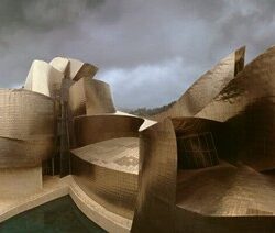
Twentieth century architecture thought “less is more” but not Gehry. A childhood spent tinkering with appliances gave him an affection for “mechanisms that spill their guts for all the world to see”. Starting with his own house, Gehry pioneered a “more expressionistic architectural language”, inspiring his profession to move beyond the pristine modernist box. Sometimes criticised for “architectural sculpture”, his best work combines “balance and elegance” with “boisterous energy”. Images are here.

Five Ways of Looking at Wifredo Lam

Lam’s work has long perplexed the art world. Born in Cuba, he moved to Spain in his early 20’s to study art. Eighteen years later he returned, wanting to blend cubism and surrealism with a Caribbean sensibility. La Jungla, his acknowledged masterpiece, does just that, placing figures amidst sugar cane and jungle foliage. Lam said the work was “an act of decolonisation … in a mental sense”. He gave “a mystical presence to [everyday] scenes”. Says a curator “There’s so much that remains to be [understood]”.

Tyler Mitchell: the photographer of the moment

Mitchell shot his first Vogue cover – of Beyonce – at age 23, an indicator of his precocious talent. Now 30, he has a high-profile career that straddles fashion and fine art. His focus is on Black style and beauty, often featuring black figures in playful or leisurely moments that contrast with charged media imagery. Having grown up in the worlds of skateboarding and music, he is hyper-aware of image. “It becomes about how we present ourselves culturally. The clothes kind of become this other thing”.

The 2025 Power 100: A User’s Guide

ArtReview’s Power 100 comes with a warning – it is subjective and prone to favour those with money. With that caveat in mind here are some takeaways from this year’s list. The art world is becoming multi-polar and “old art centres” have lost ground to the Middle East [not by much]. Artists themselves take most of the top 10 spots [good] and artists from Africa are prominent [about time]. The “old gallery model” is struggling [unlikely]. The art world conceals much of its activities [twas ever thus].

Protest Photography

London has witnessed street protest for ever. What do photographs of those events tell us? One writer thinks they are a valuable record of social history – who knew that the National League of the Blind protested in 1920 for better rights?  The meaning behind some images is not always clear – police surveillance photos sometimes resembled those taken by the protesters. Claims this writer, the show affirm that “we are here, we are alive, we matter”. Says another it is “an exhibition stuck in the past”.


Varnish & Virtue

Holbein was quite an operator. Introduced by Erasmus to Thomas More, he gravitated to Thomas Cromwell and later the royal court. A new biography calls him a “relentless pragmatist”, a workaholic, who ditched family and patrons when it suited and who churned out portraits “on an industrial scale”. But here’s the thing. Holbein painted the iconic portrait of Henry VIII that projected regal vitality and temperament but also showed a man who was “puffy, phallic and cruel”. Holbein’s head stayed on his shoulders.

“Origins of Impressionism” at the Met

Art history likes its categories. Reality is messy though, and painting movements emerge in fits and starts – as was the case with Impressionism. In the 1860’s Monet was closest to being an “impressionist”. Degas “flirted” with a classical style, Renoir was being “pretty”, Cezanne was “all over the place” and Courbet and Corot weren’t Impressionists at all. In 1868 Monet painted a modest work that highlighted reflections on a river. With hindsight, that may well have provided the “aha!” moment.

2nd December 2025

Recollecting Forwards

Siesbye happily agrees she makes nothing but ceramic bowls. Her unadorned pieces reflect ancient Anatolian forms with a modern Scandinavian overlay. Why does such seemingly plain work get so much acclaim? Partly it’s their refined designs with tiny bases and flowing lines. More though, it’s their beguiling simplicity. As Morandi (a Siesbye favourite) demonstrated “there is nothing more complicated than simplicity.” Siesbye notes the ultimate form of her work is “decided by the clay”. Images are here.

Jennifer Packer: Dead Letter

Packer is a rising star in American art, enjoying solo shows and major awards early in her career. Her latest exhibition showcases her portraiture. It’s “a memento mori” says one writer,  “what traces [people] leave after they are gone”.  That seems apt, Packer having recently suffered a personal loss. In one work “two perfectly rendered feet touch the ground. Meanwhile, the figure drifts upward and away. Packer’s layering —of paint, gesture, and meaning— mirrors the complexity of mourning.”

The Conjurer of the Sublime vs. The Cloud Architect: Turner and Constable at Tate Britain shows off a good old fashioned rivalry which is utterly spell-binding

Turner v Constable is one of art’s great rivalries. During their lifetimes that rivalry had a personal edge – the mercurial, Turner versus the “doggedly local” Constable. Turner’s scenes of turbulent weather sometimes verge on abstraction while Constable was able to show the “transcendent ordinariness” of the British landscape. So, who comes out ahead? This writer chooses Turner as the “out and out winner of this painterly race”. Strong cases for Constable are mounted here and here. The debate continues.

Robert Therrien’s smashing retrospective is among the year’s best museum solo shows

In the Broad Museum in LA, a 26 foot long table with matching 10 foot chairs is a hugely popular work. The key to this most acclaimed of Therrien’s works is not its size but what it evokes. Made exactly to scale, it reminds the viewer of “narratives and memories from childhood”. Similarly, a gigantic pile of plates forms a teetering sculpture that triggers our anxieties about plates breaking. Says a curator Therrien’s uncanny skill was to tap into the tension between “what an object is and what it means”.

William Nicholson and the pleasure in the paint

The perils of versatility. Nicholson started by designing posters where he showed “an aversion to the extraneous”. Then came book illustrations, portraits, “iconic” still lifes and landscapes. Out of all that his posters have proved influential as have his “striking” portraits. Versatility is enough to make him “beloved” but too much to be deemed distinctive. Nicholson seemingly was unconcerned, wanting only to “communicate what in the natural is irresistible and … what in the act of communication is pleasurable.”